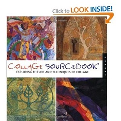
Collage Sourcebook: Exploring the Art and Technique of Collage

Holly Harrison (Author), Jennifer Atkinson (Author), Paula Grasdal (Author)
|
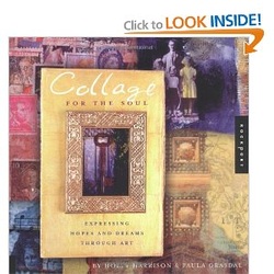
Collage for the Soul: Expressing Hopes and Dreams Through Art

Holly Harrison (Author),
Paula Grasdal (Author)
My work and project are included in this book. |
The Phillipian Online | November 3, 2011

Photo: J. QU/THE PHILLIPIAN
Interview with Scarla Pan
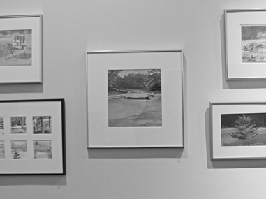
Using concise brush strokes, imagination, observation and exploration, Emily Trespas, Instructor in Art, assembles a collection of three charcoal drawings and ten paintings. Her paintings are in various mediums, from water color to gouache, acrylic and oil.
Q: What do you strive to discover when you are drawing, photographing or painting?
A: In the work that I have here, I was looking for the space between creating an image that would be recognizable. I also wanted to be economical with my mark, to be concise. We call it economy of means, showing something representatively through abstraction. If you separate them [the images], they might not make sense, but when you put them together they start to comprise something that is recognizable.
Q: Where does your inspiration come from?
A: I basically was looking at what I was drawn to. I was in the natural landscape, because I take my easel and my paints and I sit out in nature, so I’m surrounded by it. I picked a different color, and I played with the interpretation of how it could be read. It could be water, or it could be land. When I hang them, I’m not blindly hanging them [the pictures]. I’m thinking about their relationship. Some of these places really evoke this nostalgia.
Q: Are there any messages that you wish to convey to the viewer through your art?
A: I’m just working; I’m doing what I want. I will explore abstraction and representation. I’m drawn to these things. I was part of a paint-out. The breakthrough for me was that landscape could mean a lot of things.
Q: Of all of your works, is there a specific reason that you picked this collection?
A: The way they come together to create a story. I wanted to look at what worked together, what colors worked together, how the content might create connection. One image might help understand another. Why would the artist, me, put a chair and then put these small little studies? It was just a way of inspiring viewers to make their own stories as they walked around, and I hung it like that so it’s a salon style hanging where it’s jumbled in and there’s a lot to look at. It’s like taking in a story all at once or in pieces.
Compiled by Scarla Pan
Review: A Woman's Mark (Ithaca Times, March 14, 2007)

Her Mark: Works on Paper by Women Artists
The Ink Shop Printmaking Center and Olive Branch Press
Exhibition Review by MAuthur Whitman
Ithaca Times, March 14, 2007
The Ink Shop is one of Ithaca's best and most consistent art exhibition venues. The level of work shown is generally high. Shows of prints by members or invited artists - as well as the occasional traveling exhibition - are almost always put together with evident thought and care.
The latest show, curated the inimitable Christa Wolf (a member) is no exception. Entitled "Her Mark: Works on Paper by Women Artists," it attempts to invoke the spirit of the female artists' collectives of the seventies. In a welcome move, the selection of works goes beyond traditional printmaking to incorporate painting, drawing and collage.
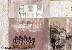
Reminiscent of work by the great German modernist Kurt Schwitters, the mixed-media collages of Emily Trespas are among the show's most engaging efforts. Like much of Schwitters' work, her pieces are small (book page sized) and feature loosely gridded compositions. Also similar is the way in which she incorporates meaningful fragments - images, textures and words - into her abstract structures. Pale pinks and greens combine with ornate found patterns and antique imagery (both printed and photographic). “Morning Song” juggles a pyramid of robin's heads, a hand with thimble, a kettle blowing painted smoke, handwriting, and Braille dots (to touch!).
Sequence I and Sequence III, by Martha Oatway, present an even more eclectic array of language and imagery. In both pieces, different "themes" occupy each of the ten squares (arranged in a two stacked rows). Subjects invoked include physics and geography. The effect is stylish and surreal.
Leslie Kramer's prints incorporate hieroglyphics and other (I believe invented) scripts and are drawn and/or patterned to resemble ancient paper or carvings. The effect looks good enough, but has a slightly hokey pseudo-archaic feel. My favorite is the etching Palimpsest with Golf Leaf - named for a yellow leaf drawn on the bottom, lacking the actual gold leaf of some of her other pieces.
April Katz's work is perhaps the most politically charged here. As she writes in her statement, her art "includes references to the biological, cultural, and environmental factors that help to shape us as individuals." From shows a headless female figurine, a (biological) cell, numerous office chairs, illegible handwriting and scientific-looking diagrams, all in a clever cubist composition of verticals, horizontals and curves. The Results Were Positive is autobiographical, recounting her experience being diagnosed with breast cancer via phone. A red-brown face in the middle with a hand holds a receiver; the cord spiraling outward suggests DNA, dissolving into a pattern of cancerous cells. A ghostly breast appears in the upper-left and a year of calendar months covers the upper two thirds.
Checkmate, by Vicky Romanoff, is a satirical anti-war drawing. Done on light brown paper with pencil (and a bit of white chalk highlighting) it makes its point with elegance and wit. In the middle of a battlefield sit a pair of crowned corpulent figures, engaged in a game of chess. Below each is a circle, suggesting a pair of wheelchairs. All around them is a mass of warring figures, depicted as a wild tangle of lines. The contrast seems clear enough: war as a cool-headed game with a clear goal versus war as anarchic bloodshed. Dividing the composition vertically are a pair of thick lines - towards the left edge a tree and toward the right what looks like a ornate street lamp. A sloping horizon and a cloudy sky occupy the top half of the sheet. The piece suggests treatments of similar themes by artists like James Ensor and George Grosz.
Also by Romanoff are two abstract collage-paintings, which she describes as "paper mosaics." Her arrangements of cut paper, overlaid with layers of paint, suggest both rigid architectural form and organic, garden-like textures. Working in a similar vein is Gloria Escobar, who cutout compositions seem slick and overly decorative in comparison. While Romanoff uses a profusion of strong colors, Escobar's palette is more limited - blacks, grays, browns and pinks dominate.
Laurie Snyder uses cyanotype, a method of producing bluish impressions of objects. Snyder's simple, striking images focus on plant-life. Cardinal Climber Rows, for example, shows nine rows of white leaves, getting smaller and smaller as the eye descends. A handful of prints by Susan Goldman depict urns and other similar vessels, seen by the artist as metaphors for the female body. This metaphor feels awfully cliched and unfortunately the quality of the work is markedly uneven.
"Her Mark" is yet another strong Ink Shop exhibit. As a collection of strong artistic sensibilities, brought together by a strong curatorial sensibility, it stands head and shoulders above most area group shows.
